Posts

Week Fourteen: The Future of Comics

Image
With the last blog post of the semester and talking about the future of comics, I choose to read "Stand Still, Stay Silent" - a webcomic Drawn to the premise from the get-go, I love the setting of a post apocalyptic story of a boy living the Icelandic countries of Iceland, Sweden, ect. With a disease running rampage across the country and the goverment scrambling to find the source of it, I was hooked with the impending danger while being drawn to the heart of the story about friendship ad exploration. I absolutely enjoyed the style of the comic through and through. It was a pleasant blending of western and Asian styles of drawing to illustrate the book. Sepia tones were used to shade and add an atmospheric perspective to the panels which helped further place me into the setting. Another aspect of the presentation I really enjoyed was the variation of the panels! No two pages were alike and you could tell the artist had a lot of fun composing these shots and did

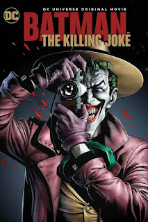
Batman : The Killing Joke assessment

Image
What is your reaction to the text you just read: My reaction to the text I just read was pure enjoyment and appreciation to the artists that worked on this novel. Being a huge fan of Batman, I had prior knowledge of the plot as a animated version of this came out last year. Where the animated version lacked is where the comic novel really shined. Emotional shifts and beats were clearer and the Joker was better established over the course of the book, having constant flashbacks to his past, setting up his clear path to madness and what his goals were. Similar to watching the animated novel, I found the ending a little ambiguous and think it was a unique and cool direction to take the ending to. The style of the book also seemed to be grungier and had more high contrast elements, setting the dark tone of the novel. What connections did you make with this story, discuss the elements of the film in which you are able to connect.  I was able to pull connections

Week Thirteen: Reconsidering the Superhero

Image
 This week I chose to read Black Panther, I had to, being a diehard Marvel fan and off a high with the recent movie that came out last year. Growing up I had never read a stand alone Black Panther story and only really saw him appearing as cameos or team ups but I knew off him. Nevertheless I love reading a stand alone comic of his and see what adventures he would embark on. I read a couple of the first few issues and off the bat, the struggle of being a ruler to his people of Wakanda and being a global superhero - defending the well being of the world was very interesting. The contrast of roles and responsibilities is such a internal conflict that the writers were able to nail perfectly in the comics and felt where the movie lacked. Black Panther is so much more than a super hero, where other hero's like Thor needs to save the world, Black Panther is more dimensional in his roles and responsibilities. The mechanics and world building also was really cool to see what a fu

Week Twelve: Comics by women

Image
This week I choose another Marvel character to read, similar to last weeks reason, I am a huge Marvel Fan. And with the next big origin story movie coming up next year, I chose to read Ms Marvel.  I remember first picking up this comic as I had not read a comic featuring a female superhero. It was a good kind of different. The protagonist, Carol Danvers is a United States Air Force pilot and through a series of events gets her power and strength from a super hero named Mar-vell. It was refreshing to see a female lead take the spotlight in fighting to try and save the universe and in opinion, she is the strongest superhero out there. A lot of internal conflict is created where she struggles to find her beginnings and where she belongs - which was interesting to see play out as she tries to find her identity. Ms. Marvel also represents and relates to a lot of young women to inspire them to be the best versions of themselves and don't give up. I find that relationship similar

Week Eleven: Comics as contemporary literature

Image
  This week I chose to read Asterios Polyp by David Mazzuchelli as I found the cover interesting and colors reminiscent of the old 3D halftone style. Off the bat I found it very hard to grasp and pick up on certain contents due to its philosophical nature and had to reread pages to stay ahead, hence why I drew my focus to the drawing styles and the characters both had their own distinctive style which I had never seen before! The theme of duality was very apparent and I was eager to see where the narrative took this story. The relationship between Hanna and Asterios was also fun to watch play out, often thinking how my parents would act in that situation. Also, based on the way this comic was written, It felt like Hanna felt like who the audience should be "living" through, serving as a the point of view for the narrative. Where I felt Asterios was the main character, it was hard to relate of even sympathize with him. All in all, despite the confusion, this comic was

Week Ten: Manga & Japanese comic's traditions

Image
This week we talked about Manga and Japanese comics and being a fan of animation and anime, I was looking forward to it. Growing up in Asia, I was fortunate enough be exposed to a wide variety of Manga.  I chose to read Ranma 1/2 due to hearing that title prior to coming to school. Off the bat, I loved every bit of the style. The style was complimentary of the culture which was deep rooted in - everything from the architecture to the use of what buildings were sitting next to each other was something I was pleased by. The style is also similar to anime like Myazaki so it was refreshing to see a familiar style yet presented differently. Another thing I noticed was the choice to caricature a lot of the facial features like a smile or a laugh to extremes - I am guessing to sell the clarity of the emotion.  Lastly, like last week the color choice was spot on and greatly admire people/artist that can pull an emotion out of audiences with the use of just color.  Overall I had a g

Week Nine: A wide world of comics

Image
This week, I chose to read Blueberry by Moebius. I was drawn to this particular reading due Moebius's collaboration with Myazaki - which I am a huge fan of. Additionally it would be interesting to see if any of the artist's ideas and styles could have possibly influenced one another's work and I was curious to see if I could find those. With my initial read of Blueberry, it was very evident that the spaghetti-western genre was a major influence in this. The classic cowboy and western setting is a popular one. Where it differs however is in its narrative, the main character acts and makes decisions while grappling with his personality and morals throughout the story. The art style in Blueberry is what you can come to expect from a typical comic book, blacks, whites, a few shades of grey. High contrast for dramatic scenes and lots of interesting compositions. The details are done very well - down to the horses hair! Lastly I love the use of colors and Moebius did a goo